Unfold your phone. Get the full site.
When you unfold, websites load their desktop version. When you fold, they go back to mobile. No buttons, no menus.
Coming soon to the App Store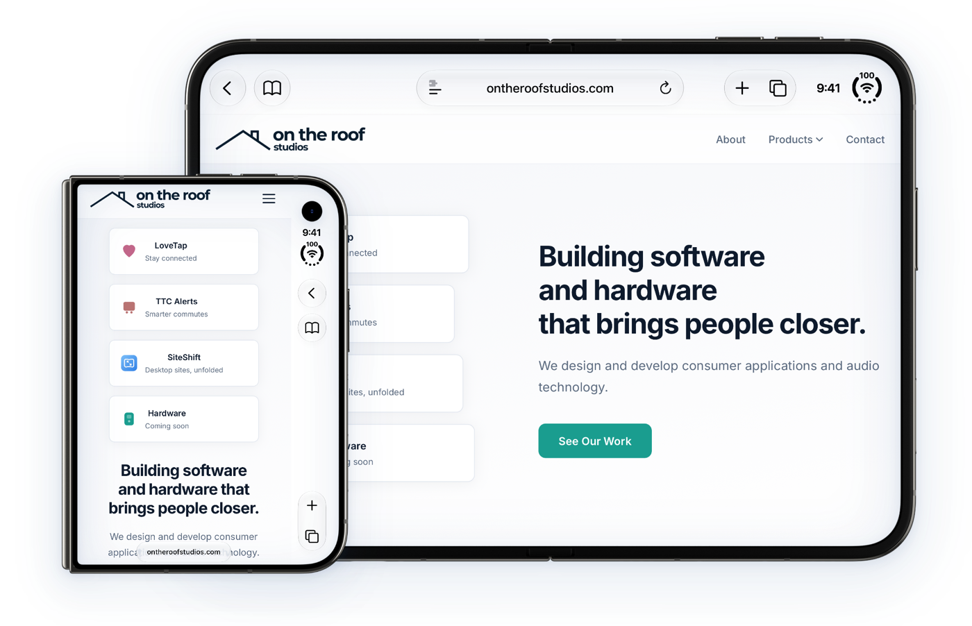
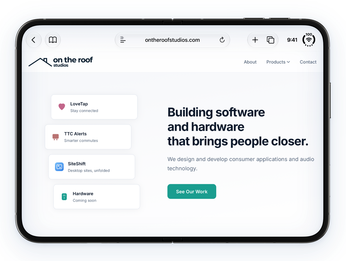
Your phone got bigger. Websites didn't notice.
Most sites see an iPhone and send the mobile version, even to the Duo's big inner display.
The big screen gets the big-screen site.
SiteShift asks for the desktop version whenever you unfold, and switches back the moment you fold.
Set it once. Then forget it's there.
Turn on the extension
In Settings, go to Apps → Safari → Extensions, turn on SiteShift and allow it on all websites. The app walks you through it.
Unfold for desktop
Open your iPhone Duo and the page reloads in its desktop layout, with every menu, column and sidebar.
Fold for mobile
Close it and sites switch back to their mobile version, sized for the outer display.
Small extension. Big difference.
Big screen. Big-screen sites.
SiteShift makes the same change as Safari's own "Request Desktop Website", but does it for you every time you unfold. Pages after the first load as desktop straight away.
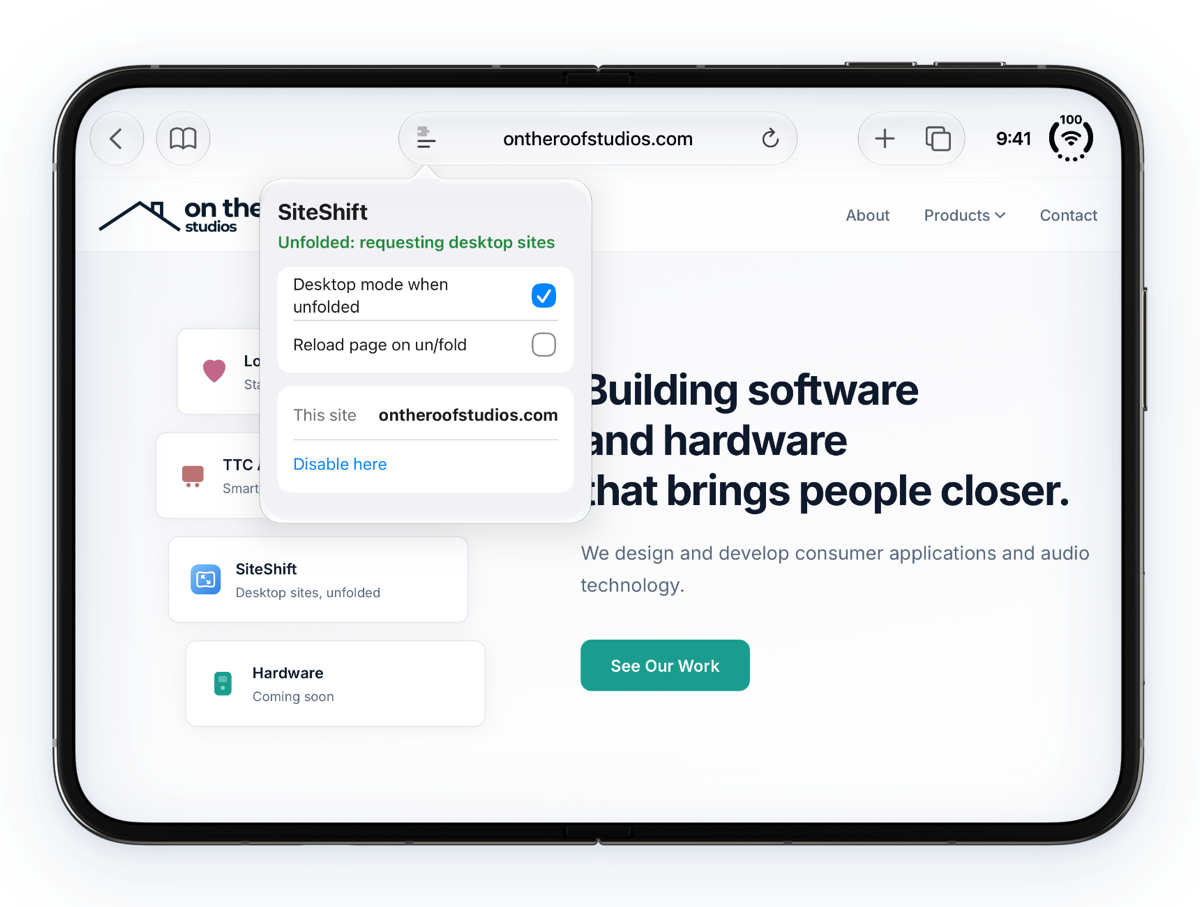
Keep any site mobile.
Prefer a site's mobile version? Tap SiteShift in Safari's toolbar and choose "Disable here". You can also turn desktop mode or automatic reloading off at any time.
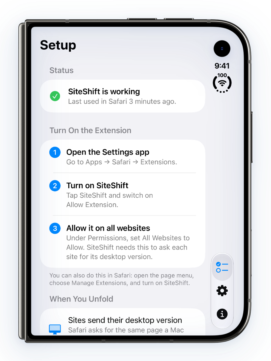
Know it's working.
The SiteShift app shows whether the extension is on and when Safari last used it, so you're never guessing. Your settings stay in sync between the app and Safari.
Does one thing. Keeps nothing.
No account
Install it, turn it on, done. There's nothing to sign up for.
No tracking
No analytics and no data collected. Read the privacy policy
Only when unfolded
Folded, and on other iPhones, nothing changes.
Open your phone. Open the full web.
SiteShift works quietly in Safari, every time you unfold.
Coming soon to the App Store